Before I go further, let me give you a link to the source for this blog post available on Github
###
When we talk about doing charts, post people will think about Excel.
Excel do provide some very rich charting but the problem is that you need a licence for Excel. Second, you need to share a file that often have over 30Mb of data to display a simple chart about your monthly sales or what not.
While it is a good way to explore your data, once you know what you want… you want to be able to share it easily. Then you use the first tool available to a Microsoft developer… SSRS.
But what if… you don’t need the huge machine that is SSRS but just want to display a simple graph in a web dashboard? It’s where simple charting with Javascript comes in.
So let’s start with d3js.
What is d3.js?
d3js is a JavaScript library for manipulation documents based on data. It will help you create HTML, CSS and SVG that will allow you to better display your data.
However… it’s extremely low level. You will have to create your axis, your popup, your hover, your maps and what not.
But since it’s only a building block, other libraries exist that leverage d3js…
Dimple
Dimple is a super simple charting library built on top of d3js. It’s what we’re going to use for this demo. But we need data…
Let’s start with a simple data set.
Sample problem: Medal per country for the 2010 Winter Olympics
Original data can be found here: http://www.statcrunch.com/app/index.php?dataid=418469
I’m going to just copy this into Excel (Google Spreadsheets) to clean the data a bit. We’ll remove all the “Country of ”, which will only pollute our data, as well as the Bins which could be dynamic but are otherwise useless.
First step will be to start a simple MVC project so that we can leverage basic MVC minimizing, layouts and what not.
In our _Layout.cshtml, we’ll add the following thing to the “head”:
1 | <script src="http://d3js.org/d3.v3.min.js"></script> |
This will allow us to start charting almost right away!
Step one: Retrieving the csv data and parsing it
Here’s some code that will take a CSV that is on disk or generated by an API and parse it as an object.
1 | $.ajax("/2010-winter-olympics.csv", { |
This code is super simple and will display something along those lines:
Wow. So we are almost ready to go?
Step two: Using Dimple to create our data.
As mentioned before, Dimple is a super simple tool to create chart. Let’s see how far we can go with the least amount of code.
Let’s add the following to our “success” handler:
1 | var chart = new dimple.chart(svg, csv); |
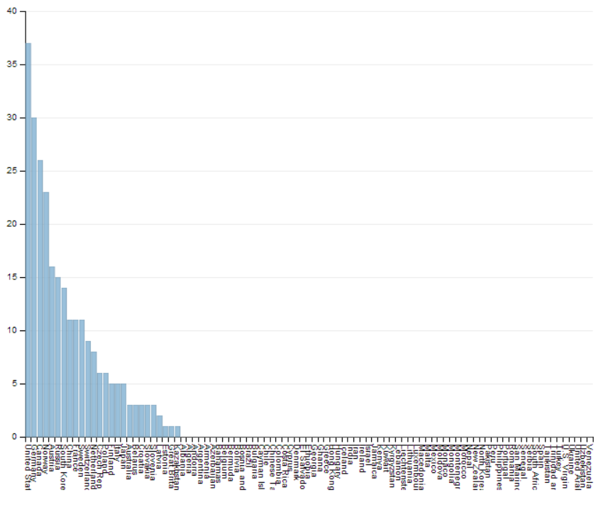
Once we refresh the page, it creates this:
Okay… not super pretty, lots of crappy data but… wow. We already have a minimum viable data source. To help us see it better… let’s clean the CSV file. We’ll remove all countries that didn’t win medals.
For our data set, that means from row 28 (Albania).
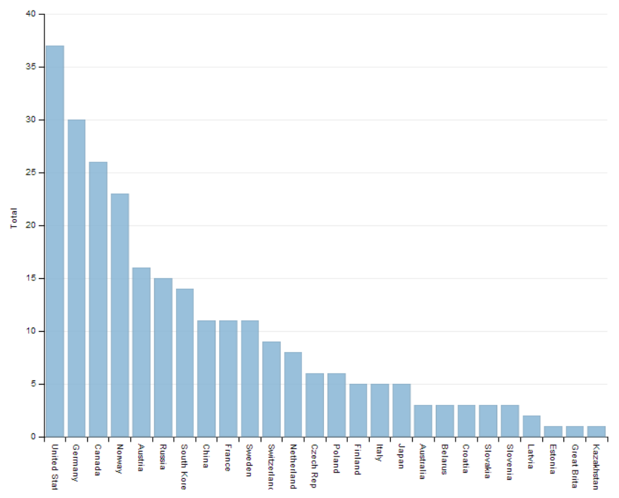
Let’s refresh.
And that’s it. We now have a super basic bar graph.
###
Conclusion
It is now super easy to create graphs in JavaScript. If you feel the need to create graphs for your users, you should consider using d3.js with charting library that are readily available like Dimple.
Do not use d3.js as a standalone way of creating graphs. You will find it harder than it needs to be.
If you want to know more about charting, please let me know on Twitter: @MaximRouiller


