So we started by doing some graphs from basic data. But having all the colors the same or maybe even showing bars is not enough.
Here are a few other tricks to make the graph a little bit nicer. Mind you, there is nothing revolutionary here… it’s all in the documentation. The point of this blog post is only to show you how easy it is to customize the look of your charts.
First thing first, here are the sources we are working with.
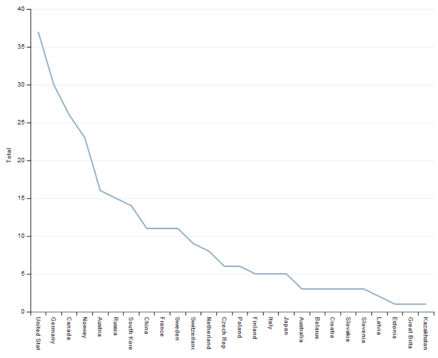
Showing lines instead of bars
Ahhh that is quite easy.
It’s actually as simple as changing the addSeries function paramter
Here’s what the current code look like now:1
2
3
4
5
6
7
8
9
10var post2 = function() {
// blog post #2 chart
var svg = dimple.newSvg("#lineGraph", 800, 600);
var chart = new dimple.chart(svg, csv);
chart.addCategoryAxis("x", "Country");
chart.addMeasureAxis("y", "Total");
chart.addSeries(null, dimple.plot.line);
chart.draw();
};
post2();
And the graph looks like this:
Simple enough?
Of course, this isn’t the type of data for lines so let’s go back to our first graph with bars and try to add colors.
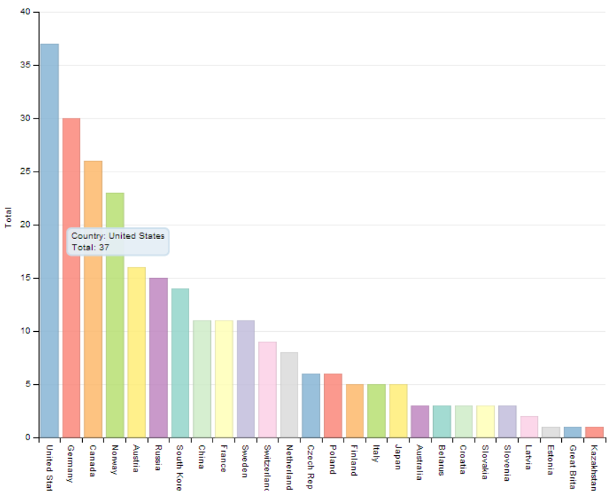
Adding a color per country
So adding a color per country is about defining the series properly. In this case… on “Country”.
Changing the code isn’t too hard:1
2
3
4
5
6
7
8
9var post1 = function() {
var svg = dimple.newSvg("#graphDestination", 800, 600);
var chart = new dimple.chart(svg, csv);
chart.addCategoryAxis("x", "Country");
chart.addMeasureAxis("y", "Total", "Gold");
chart.addSeries("Country", dimple.plot.bar);
chart.draw();
};
post1();
And here is how it looks like now!
Much prettier!!
Next blog post, what about adding some legends? Special requests?

