Storyboard are charts/graphs that tell a story.
To have a graph, you need a timeline. Whether it’s days, weeks, months or years… you need a timeline of what happens. Then to have a chart, you need two axis. One that tells one version of the story, the other that relates to it. Then you move things forward in time and you move the data point. For each of those point, you also need to be able to label that point.
So let’s make a list of what we need.
- Data on a timeline.
- One numerical data
- Another numerical data that correlate to the other in some way
- A label to identify each point on the graph
I’ve taken the time to think about it and there’s one type of data that easy to come up with (I’m just writing a technical blog post after all).
Introducing the DataSet
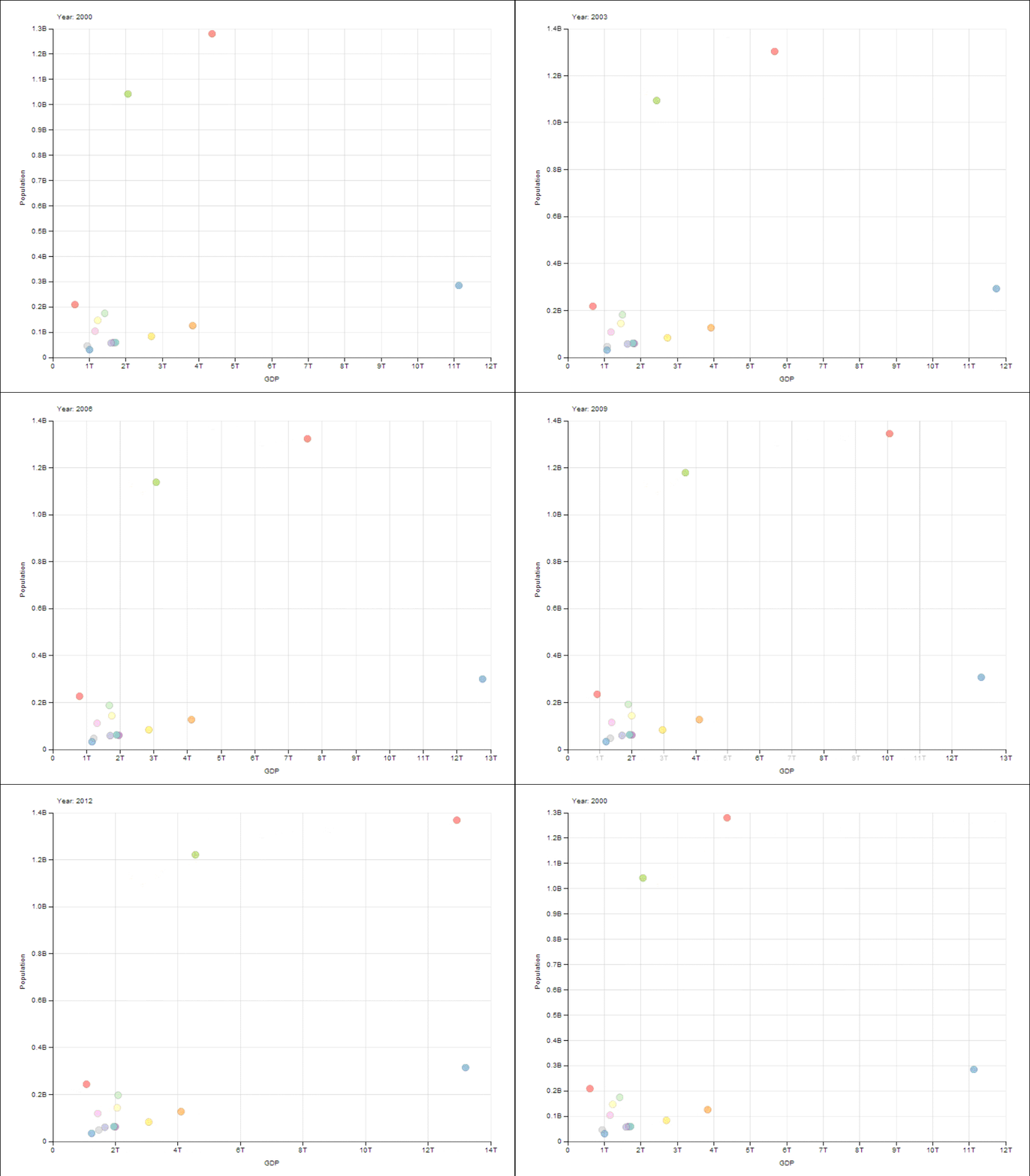
I’ve taken the GDP, Population per country for the last 30 years from World Economics and merged it into one single file.
Note: World Economics is very keen to share data with you in format that are more readable than what is on their website. Contact them through their twitter account if you need their data!
Sound simple but it took me over 1 hour to actually merge all that data. So contact them to have a proper format that is more developer friendly.
Here’s what is the final result:
So this is the result I have.
The Code
That’s the most bonkers thing ever. Once you have the data properly setup, this doesn’t require that much code. Here’s what the code to generate the same graph on your end:1
2
3
4
5
6
7
8
9
10
11
12
13
14
15
16
17
18
19
20
21
22
23
24$.ajax("/GDP.csv", {
success: function (data) {
var csv = d3.csv.parse(data);
var post3 = function () {
var svg = dimple.newSvg("#storyboardGraph", 800, 600);
var chart = new dimple.chart(svg, csv);
csv = dimple.filterData(csv, "Year", ["2000", "2001", "2002", "2003",
"2004", "2005", "2006", "2007", "2008", "2009", "2010", "2011",
"2012", "2013", ]);
var frame = 2000;
chart.addMeasureAxis("x", "GDP");
chart.addMeasureAxis("y", "Population");
chart.addSeries(["Country"], dimple.plot.bubble);
var story = chart.setStoryboard("Year");
story.frameDuration = frame;
story.addOrderRule("Date");
chart.draw();
};
post3();
}
});
Conclusion
Stop using weird graphing library that will cost you an arm and a leg. Your browser (both desktop and mobile) can handle this kind of technology. Start using it now.
See DimpleJS for more examples and fun scenario to work with. Don’t forget to also follow John Kiernander on Twitter.
As usual, the source is available on Github.
Enjoy!

